Product Tags Component
Product recommendation component features within Fanplayr's Creative Editor.
Examples
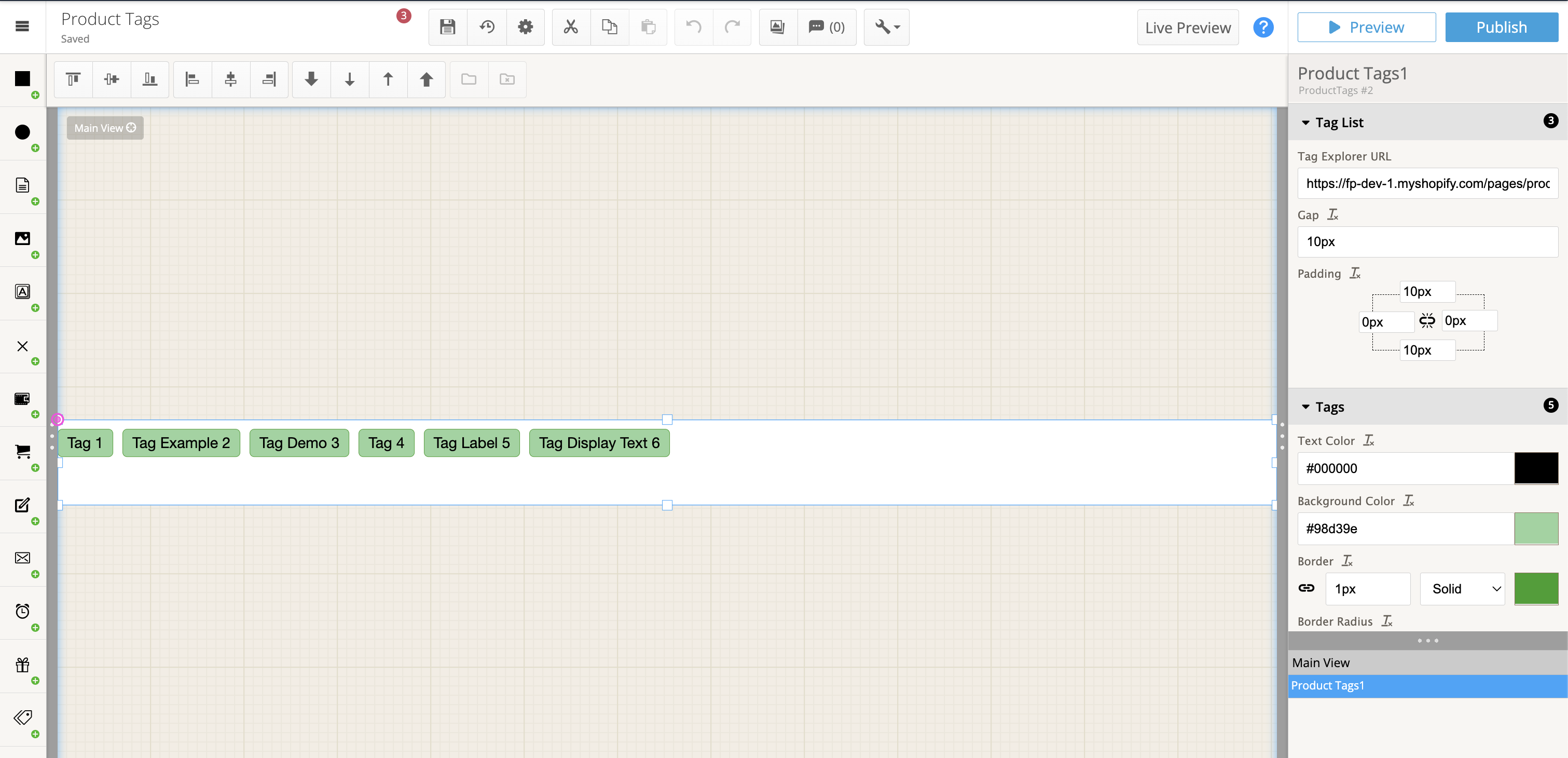 Example of product tags component
 The product tags component icon
Concepts
High-level concepts related to this component:
- Displays a list of Verada AI product tags The number of product tags will depend on the current page's product. We recommend resizing the widget vertically to match the number of tags you would like to show. If there is no current page product, the tags will instead consist of the most popular product tags across your catalog (by clicks).
- Clicking tags When a user clicks a product tag, the user will be directed to the linked Product Tag Explorer widget
- Widget presentation is dependent on this component When a product tags component is used in a widget, the widget will wait for the product tags to be returned from the service before displaying the widget.
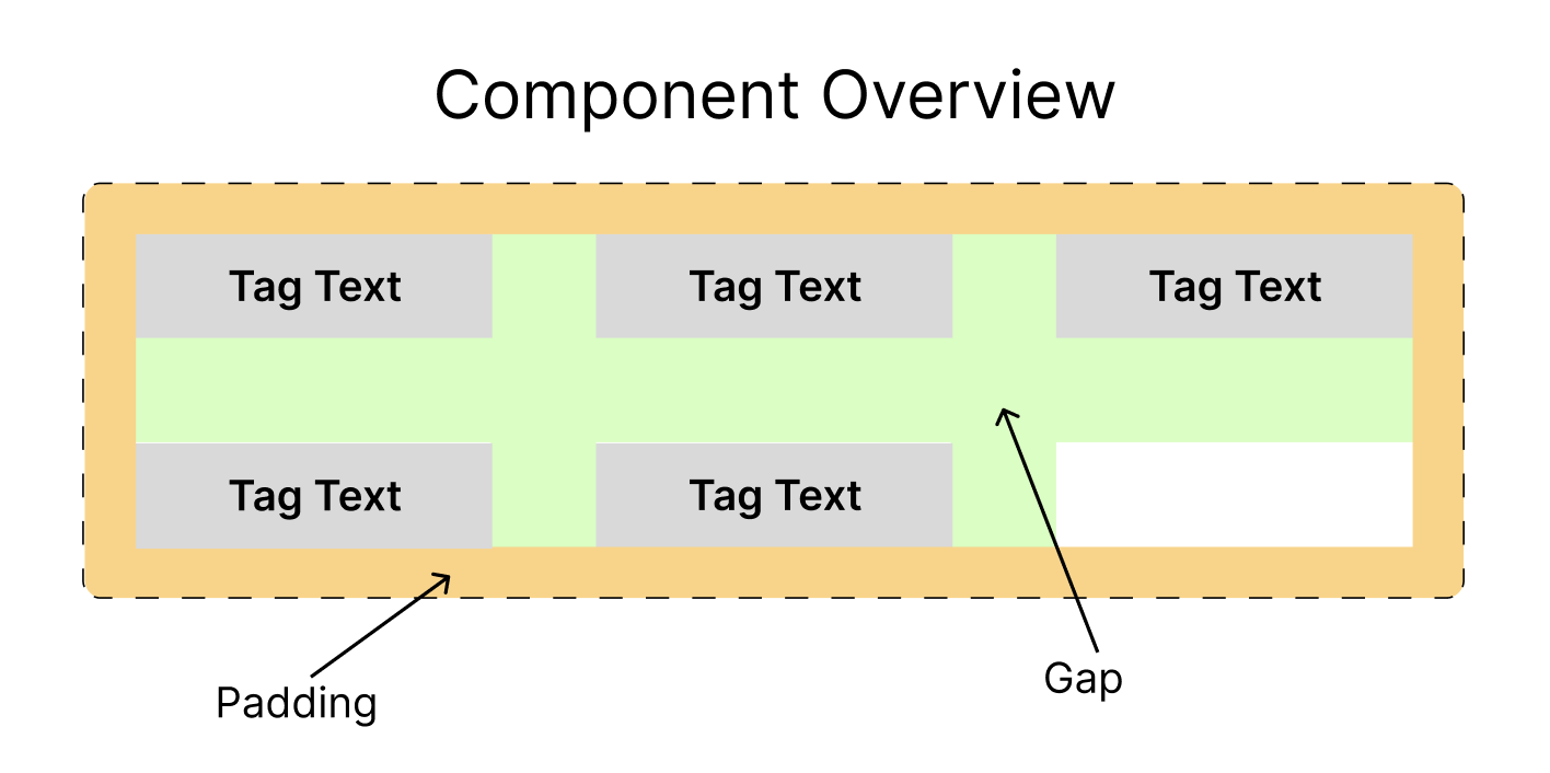 Structure of the product tag list component
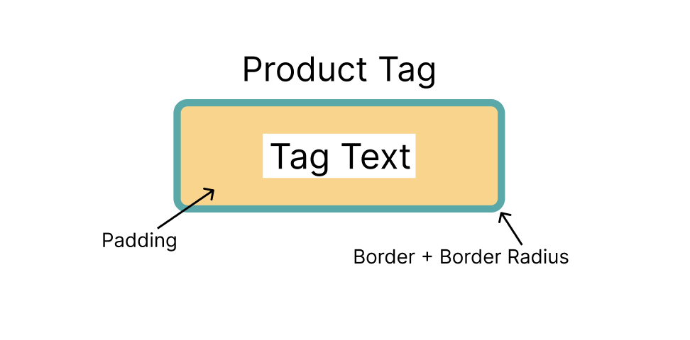 Structure and layout of the tag
General properties
Tag Explorer URL
- Type: URL
Indicates where the user will be directed when they click on a tag. Must be a valid "https://" URL.
Gap
- Type: Integer (Pixels)
Controls the space between tags (both vertically and horizontally)
Padding
- Type: Padding
Controls the padding between the group of tags and the outer edge of the component.
Product Tag Properties
These properties relate to the look of each product tag.
Text Color
- Type: Color
The tag text color.
Background Color
- Type: Color
The background color of the tag.
Border
- Type: Border
Customizes look of each tag's border.
Border radius
- Type: Border radius
Standard border radius style.
Padding
- Type: Padding
Controls padding between text and edge of each tag.