Using Components
Managing Components
Components can be added to your widget by dragging them from the Component Palette on the left into a view.
Select components by clicking on them. Multiple components can be selected by holding the SHIFT key.
Delete the current selection by pressing the DELETE key.
INFO
Click the empty space around a view component to clear your selection.
Positioning & Resizing
- Components are positioned using X & Y coordinates.
- Each component has an origin that allows it to be centered or anchored from an edge. The X & Y coordinates are relative to this origin.
- Positions and dimensions can be specified in pixels (
px) or percentages (%). - Components can be positioned and resized using the mouse, or by editing the respective properties directly in the Property Panel.
INFO
Views are positioned in the same manner as other components, except that a view's origin is relative to the browser viewport (or relative to the containing element a view is inserted for embedded views).
Aligning & Ordering
The editor has useful actions that can be applied to the current selection.
The alignment actions can be used to align (move) a single component to the center or edge of its view. When multiple components are selected, the alignment actions center or align the components relative to each other. E.g. This is allows vertically aligning multiple components with each other.
The ordering actions allow you to change the layering order of components. You can move a component up or down one layer at a time, or send a component to the absolute top or bottom of the layer list.
Duplicating Components
The standard copy, cut and paste commands work with selected components in the editor. You can use the respective action buttons at the top of the editor or by using the standard shortcuts:
- Cut (
⌘+X) - Copy (
⌘+C) - Paste (
⌘+V)
Hiding Components
Components can be hidden by toggling the Hide / Visible property. Hidden components can be selected and made visible again by finding them in the Layer Panel.
Layer Panel
The Layer Panel shows a list of all views and their components that are used in your widget.
The Layer Panel can be toggled by double-clicking the panel header in the bottom-right of the editor. The panel can be resized vertically by clicking and dragging the header.
- Hidden components are shown in red.
- Components can be selected by clicking their name. Multiple components can be selected by holding the
SHIFTkey
Renaming Components
Components are given a default name when you add them to your widget. You can rename components to make names more meaningful by clicking and editing its name at the top of the Property Panel.
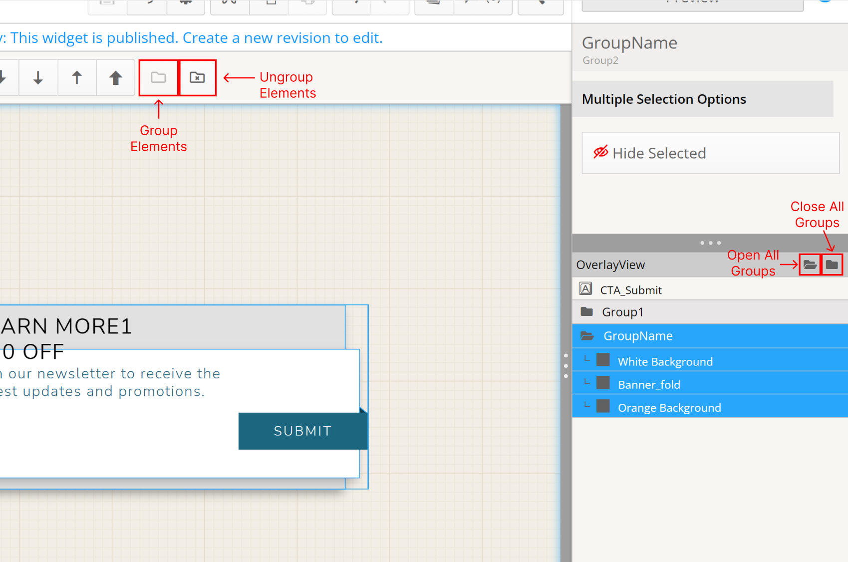
Grouping Components
Components within a particular view can be grouped together using the group button (folder icon) at the top of the screen or by using ctrl/⌘ + G. Items in a group can be removed from a group by clicking the de-group button or by using ctrl/⌘ + SHIFT + G.
A group of elements show as a folder in the view's component list in the sidebar, and you can choose to see the components in the folder or hide them in the list. Also when a group is selected, you have the opportunity to hide or show the selected components in the editor by clicking "Hide / Show Selected" in the sidebar.
Groups can be renamed in the exact same way as a component or view by clicking on the name at the top of the sidebar.
Grouped components retain their specific settings including positioning, anchoring, and size. After being grouped, these components can still be selected individually inside their parent group by opening the folder in the sidebar and clicking the component itself.
 Grouping Functionality
INFO
Note: Grouping does not link positioning values or other data between the inner components. In general, the behavior of a group when editing is identical to that of a non-grouped multi-selection of components. It is simply a method of organization.