Editing Widget
Introduction
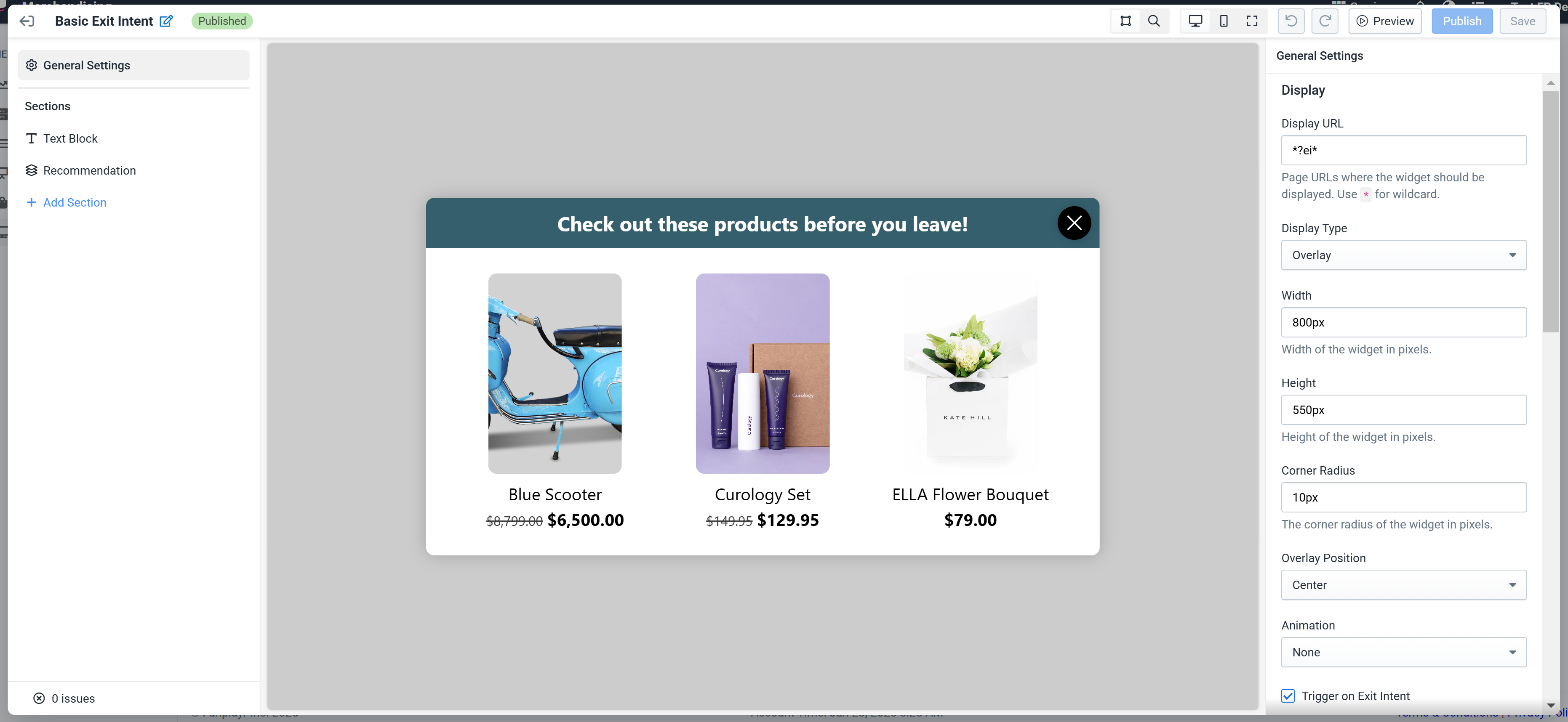
Figure 1: Widget Editor
Upon clicking "Create" or "Edit" on one of your Widgets you will see a full-page editor (Figure 1). The editor comprises four main sections:
- Top navigation bar — Basic editor-wide controls
- Section sidebar — List of all sections of the widget for easy navigation
- Preview area — View of the current state of the widget
- Settings sidebar — Contains all settings and customization options for the widget
INFO
The widget editor is an extension of the Personal Shopper editor. If you are familiar with the shopper editor, you will have an easy time learning the widget editor.
Top Navigation Bar

Figure 2: Top Nav
The top navigation bar contains all the editor-wide controls for the Personal Shopper editor (Figure 2):
- Back button closes the editor.
- Name is an identifier for the particular widget. Click the edit button to customize the name. The name change is not finalized until the widget is saved / published.
- Status badge indicates whether the widget you are editing is in "Published", "Draft", or "Disabled" state. See note below.
- Preview toggle switches between "preview" and "selection" mode. In preview mode you will be able to interact with the widget as you would on your site. In selection mode, when clicking on the widget preview you will select components.
- Breakpoint toggle changes the preview area between three different sizes: desktop, mobile, and full screen.
- Undo and redo buttons
- Primary actions of the editor. "Preview" initiates the Live Preview functionality. "Publish" will save and publish the current working version of the widget to your site. "Save" will save the current working version of the widget but does not update the live version on your site.
INFO
Important: The runtime system always uses the most recently published version of each widget. However, published widgets can still be updated and have their status changed to "Draft". In this case, the now "Draft" widget is still being used on your site using the previously published version. Disable a widget in the list to stop it from being used.
Live Preview
By clicking the "Preview" button in the top nav bar, you will access the "Live Preview" feature of the widget editor.
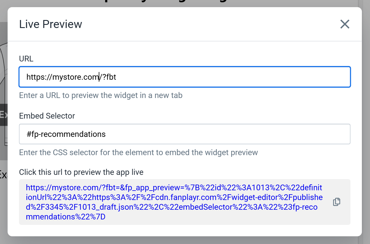
Figure 3: Live Preview
Live Preview allows you to view the version of the widget you are editing live on your site without having to Publish. In order to use this feature the working version of the widget must be saved.
If your widget is marked as embedded, you will be required to specify an embed selector in this popup. Otherwise, all you will need to provide is a URL to test the widget. The URL must on a domain you have the Fanplayr Targeting script running on. This URL does not have to match the URL defined in the widget configuration. In other words, you can preview the widget on a different URL than where the widget will ultimately appear if you wish.
Previewing the widget gives you the ability to see what it would look like on your site before making it available to all your users. This allows you to fine tune the look and feel of the widget before Publishing.
Section Sidebar
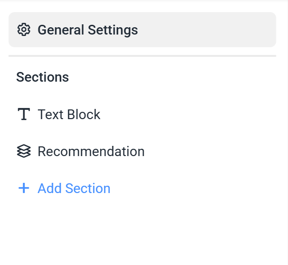
Figure 4: Section Sidebar
On the left side of the editor is the Section Sidebar. This provides easy navigation between sections of the editor. Click each section to automatically scroll the preview area to the specific section and edit the component's settings. You can click on the left side of each section and drag it up or down to move it around the widget.
At the top of the sidebar is a link to the "General Settings". Clicking this will allow you to edit some generic configuration for the widget. See Settings Sidebar for more info.
Adding a Section
Click the "Add Section" button in the sidebar to select a new component to add to your widget.
.DACO4RTI.png)
Figure 5: Add Section Popup
Select a component in this list and click "Add" to append a new section to the end of your widget.
Viewing Errors / Issues
At the bottom of the Section Sidebar there is an indicator which shows how many issues that may prevent publishing are present in your widget. Clicking the indicator will show more information about any issues and how to resolve them.;
Preview Area
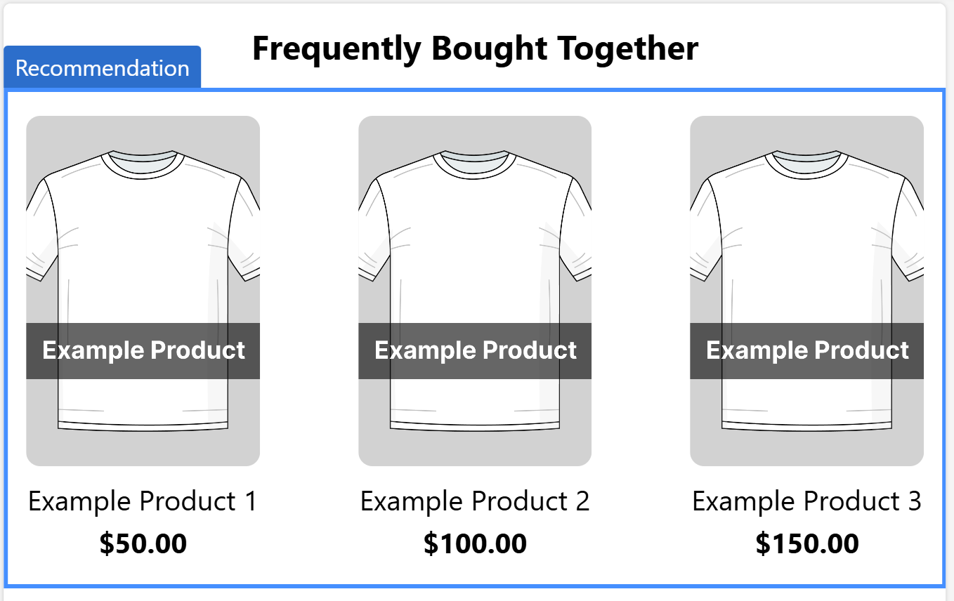
Figure 6: Preview Area
The main part of of the widget editor is the preview area. It is a responsive view of your widget that gives you an indication of how it will look on your site. By default, the preview is in "selection" mode (see Navigation Bar) which means that you can highlight and select individual sections to view and edit their settings.;
Settings Sidebar
The settings sidebar is on the right side of the editor and is where a majority of the customization of the widget is done. There are two groups of editable settings in the sidebar: "General Settings" and "Component Settings".
General Settings
If "General Settings" is selected in the left sidebar, the settings sidebar on the right will consist of the widget's general configuration.
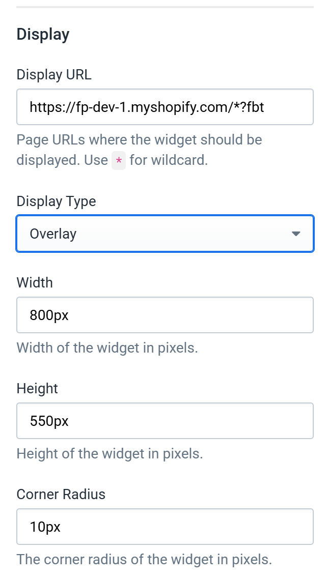
Figure 7: General Settings
The general widget settings contain various controls that govern the general behavior of the widget. Below we will break down a few key settings:
- Display Type — This controls whether the widget is "embedded" into the site or is an "overlay".
- Display URL — This is the URL on your domain in which the system will try to render the widget once published. This string can include wildcards (*) so that it can be used on more than one URL.
- Embed Selector — This is the CSS element selector that will be used to find the element to which the widget will be appended (if embedded).
- Height + Width — This is the maximum height and width of the widget (if overlay).
- Trigger on Exit Intent — If enabled, the system will only show the widget if the user signifies "exit intent" by moving their mouse to the edge of the screen (if overlay).
- Trigger After Delay — If set, the widget will only be shown after a delay matching the defined value in seconds (if overlay).
The remaining general settings consist of various widget-wide styling including base font size and color, heading font sizes, and overall background color. Also, there is a setting called "Global CSS" that allows advanced users with knowledge of CSS to write CSS that will be applied to the whole widget.
Component Settings
.DCzU6xe-.png)
Figure 8: Component Settings
If a specific component is selected, the right sidebar will consist of all settings for the selected component. For example, in Figure 8, a product recommendation component is selected.
Each component will have its own unique set of settings to customize the look and feel of the component. Each setting will only apply to that specific section. For example, if you set the "Default Text Align" setting for one product recommendation component, it will not impact the same setting on any other product recommendation components.
Like with "General Settings", every component will have a "Custom CSS" setting that advanced users can take advantage of to further customize their components.
Product Source
The most crucial setting for any product recommendation component is the "Product Source". This setting's value informs the system which products to show in the component. Clicking "Change" in the setting editor will bring up the popup in Figure 9.
.DXxf4vVJ.png)
Figure 9: Product Source Editor
The specific settings here can depend on the model selected, but they generally boil down to the following four settings:
- Model — Controls the algorithm used to generate the list of products
- Product List — This is the list of products that the selected algorithm can source its products from. This can be used to limit your recommended products to just products on sale for example.
- Minimum Items — Minimum number of items in order to render the product recommendation component
- Product Limit — Maximum number of products to show in the component
INFO
If you use the "Others You May Like", "Frequently Bought Together", or any "Product Activity" models, the widget will only show on a product page as these models are based on the currently viewed product.
Product Activity
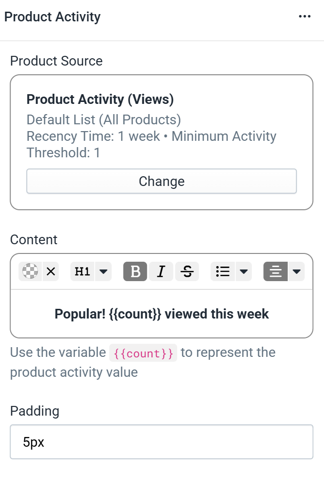
Figure 10: Product Activity Component
If the widget is of type "Product Activity" (see Creating Widget), then instead of a product recommendations component you have access to a "Product Activity" component. The settings for this component can be seen in Figure 10.
The key element of these settings has to do with the variable {{count}} used in the "Content" text setting. Product activity provides an real-time value for the number of times the current product has been viewed / added to cart / purchased recently (as defined in the product source). To access this value in your widget, you must use the {{count}} variable somewhere in your "Content" text.
The "Product Source" setting for Product Activity also defines a setting for "Minimum Activity". If at runtime the value to be shown in for the activity count is below this setting, the widget will not be shown.