Chart Types
The Query Playground supports a range of chart types designed for behavioral data analysis. Each chart type supports different combinations of measures, dimensions, and other options. Some charts are highly customizable; others are more specialized or purpose-built.
Core Chart Types
These are general-purpose visualizations used across most dashboards and queries.
Measure Group
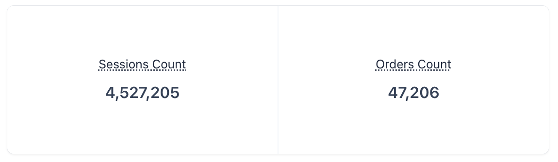 Measure Group
A simple, single-dimensional visualization showing only measures—without any grouping or segmentation.
Best for: High-level metric snapshots (e.g., total sessions, conversion rate)
No dimensions allowed
Measure Funnel
Displays a sequential drop-off between multiple measures. Helps visualize how users progress through different stages of a funnel (e.g., Sessions → Add to Cart → Orders).
Measures should be ordered logically (top to bottom)
Best for: Conversion flow analysis
No dimensions allowed
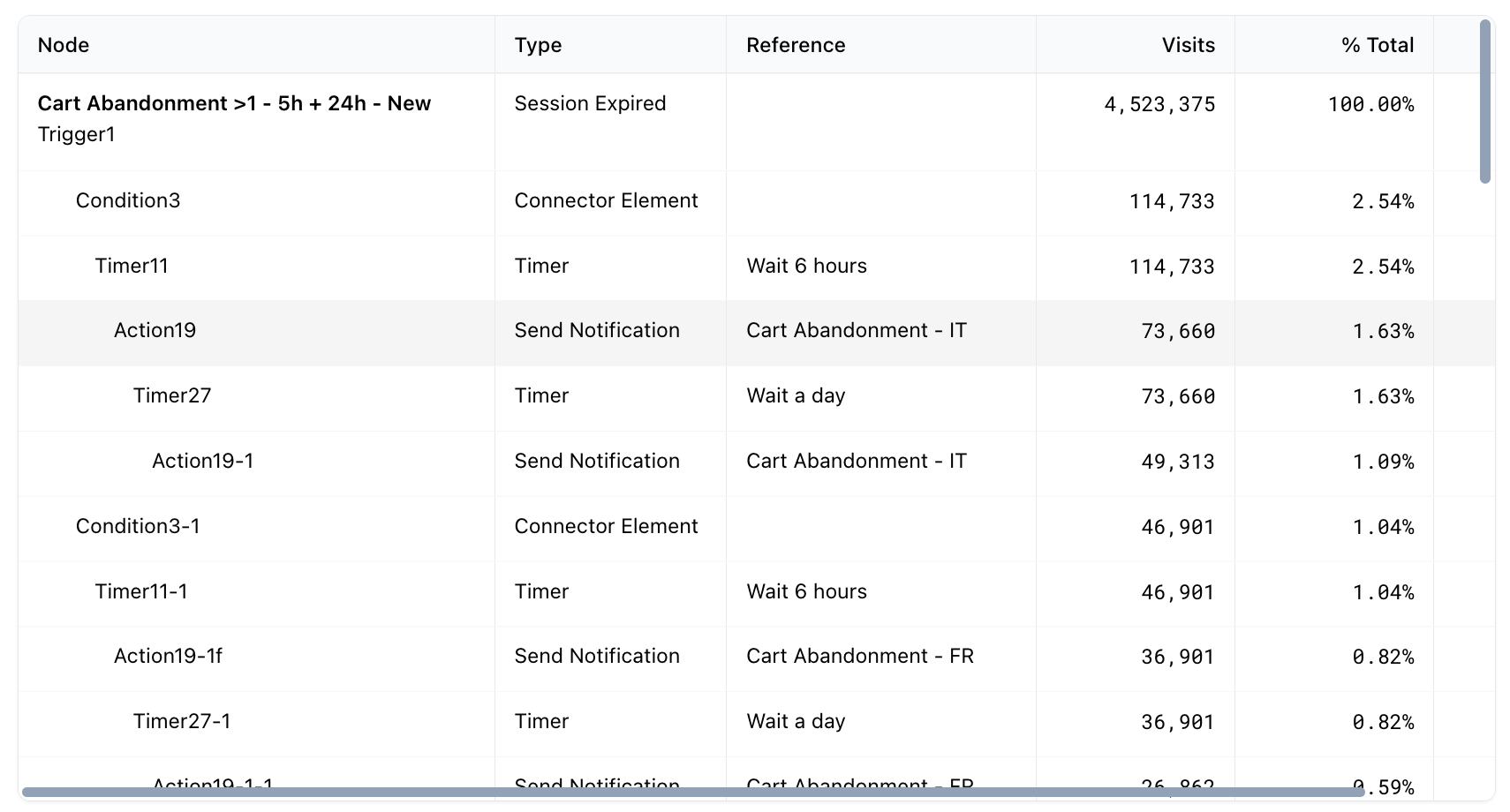
Table Chart
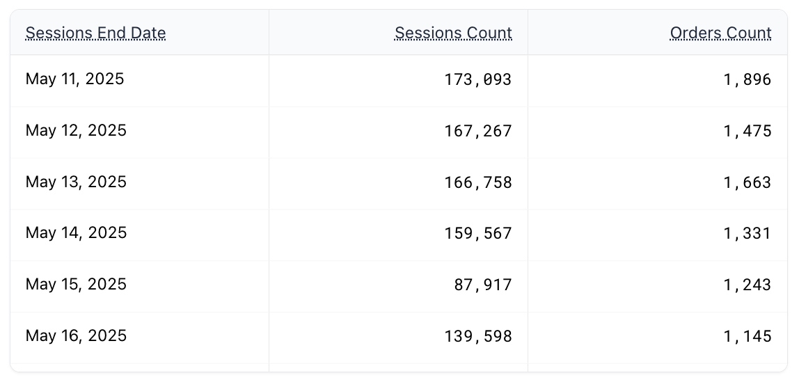 Table Chart
A flexible, standard table visualization showing one or more dimensions with associated measures.
Supports sorting and row limits
Best for: Auditing data, exporting results, or granular comparison
Heatmap
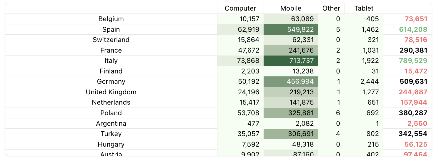 Heatmap
A two-dimensional table chart that visually emphasizes values using color gradients. Measures can be aggregated across both a row dimension and a column dimension.
Useful for spotting patterns and outliers
Best for: Time-of-day analysis
Horizontal Bar Chart
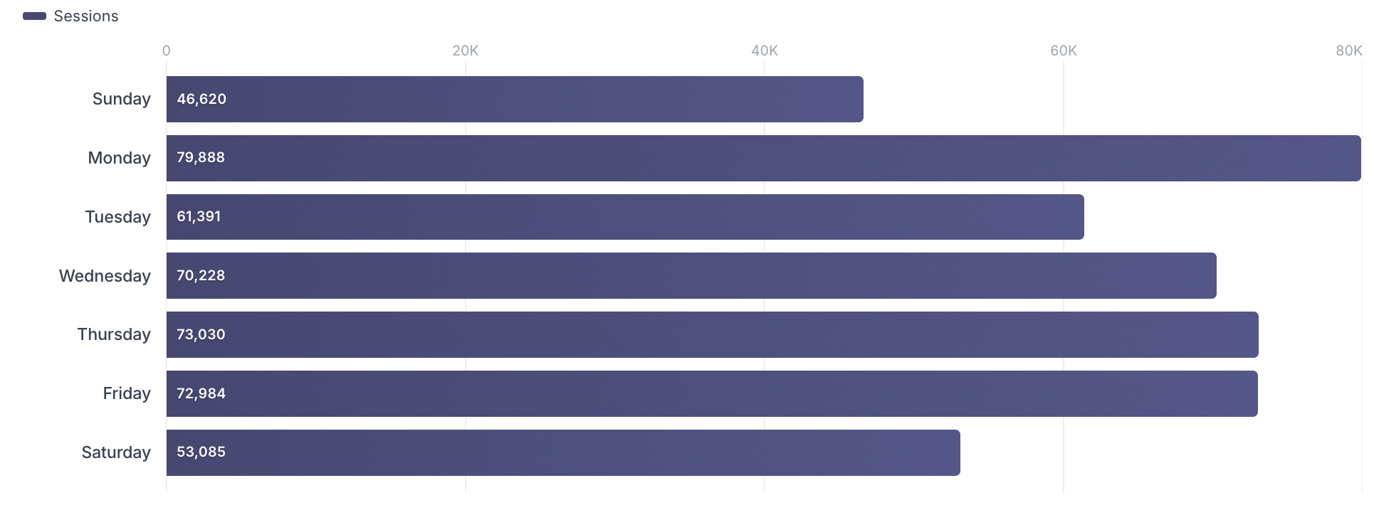 Bar Chart
Displays horizontal bars for a one or more dimensions and one or more measures in a scrollable chart.
Measures can be stacked or rendered side-by-side (configurable via settings)
Best for: Comparing values across many categories (e.g. countries, sources)
Column Chart
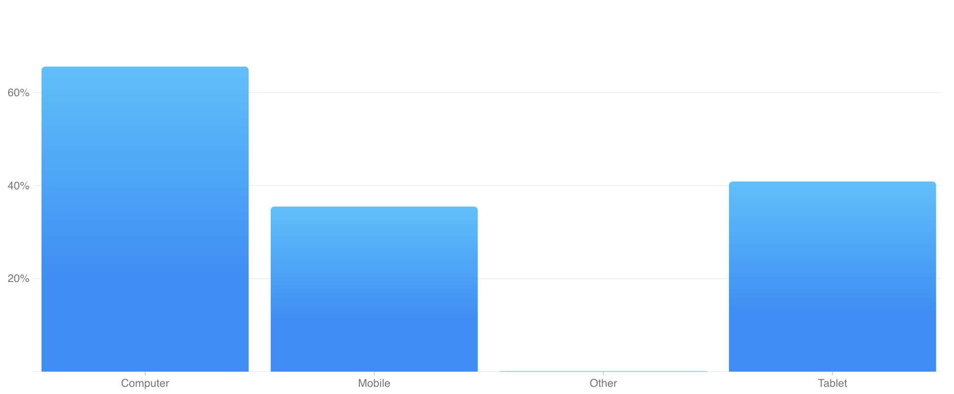 Column Chart
Displays column bars for a one or more dimensions and one or more measures.
Measures are grouped (not stacked)
Best for: Comparing values across few categories (e.g. device, browsers)
Stacked Column Chart
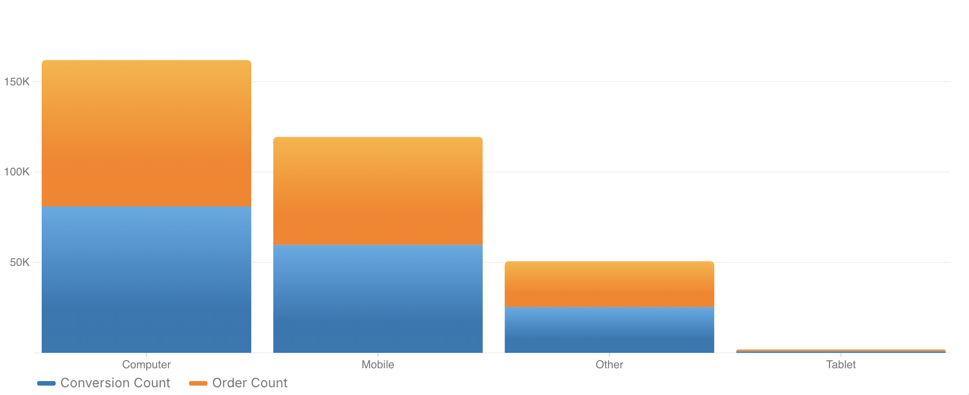 Stacked Column Chart
Same layout as the Column Chart, but measures are stacked to show contribution within each dimension value.
- Best for: Visualizing part-to-whole relationships per category
Line Chart
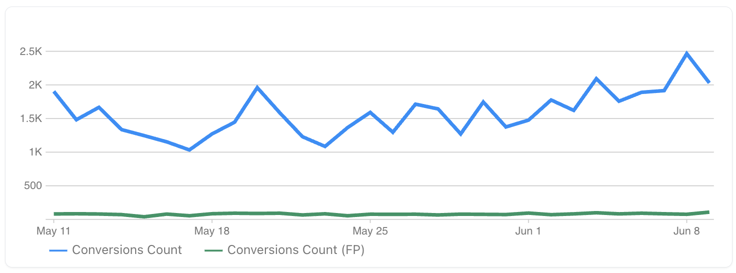 Line Chart
Plots multiple measures across one or more dimensions (usually time). Great for showing trends and comparisons over time.
- Best for: Time series analysis
Area Line Chart
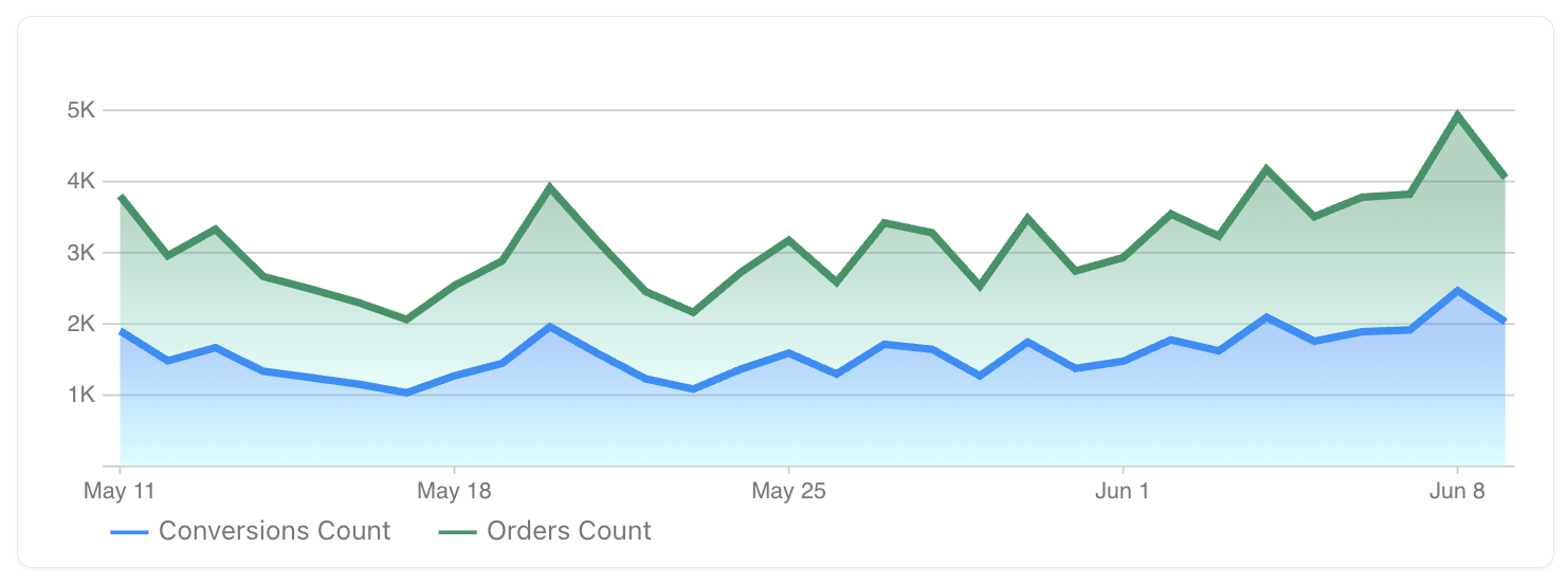 Area Line Chart
Like the Line Chart, but with stacked area shading to emphasize cumulative values.
- Best for: Showing overall growth and relative measure contribution over time
Combo Chart
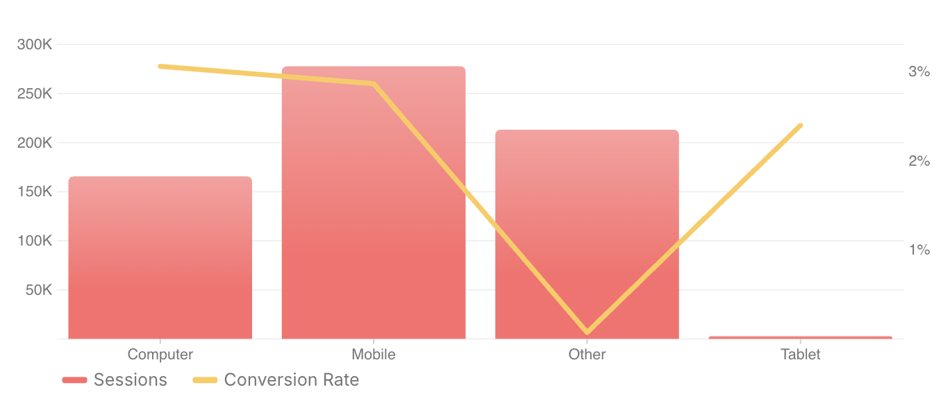 Combo Chart
Same as Line or Column Chart, but designed to be customized further with the Chart Options
- Best for: Complex combinations of line + column content
Pie Chart
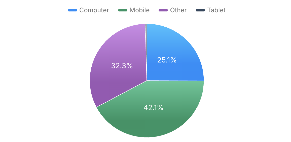 Pie
Pie
Displays a circular chart divided into slices to illustrate proportionate contributions of a dimension across a measure.
- Best for: Visualizing part-to-whole relationships (e.g., traffic sources, device types)
Bubble Chart
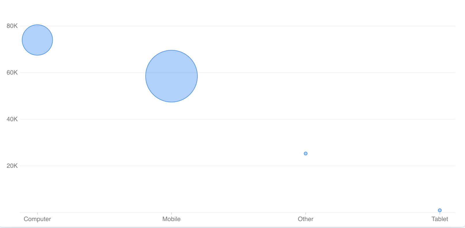 Bubble
A scatterplot-style chart where each point (or “bubble”) represents a data grouping, with position and size based on measure values.
Requires one dimension and two measures
- Best for: Identifying correlations, distributions, and outliers across multiple variables
Specialized / Custom Charts
These charts are tailored to specific use cases and may have limited customization.
Customer Waterfall
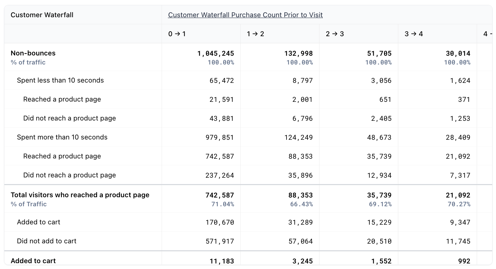 Customer Waterfall
A conversion flow chart showing how users move between behavioral buckets.
Only supports the following dimensions:
Session End DatePurchase Count Prior to VisitPurchase Count Prior 7 DaysVisit Count Prior 7 Days
Best for: Conversion and engagement path analysis
Stream Table
 Streams
Displays statistics on the performance of your Fanplayr Streams.
Use the Options panel to focus on a specific stream
Best for: Stream performance reporting
A/B Testing Table
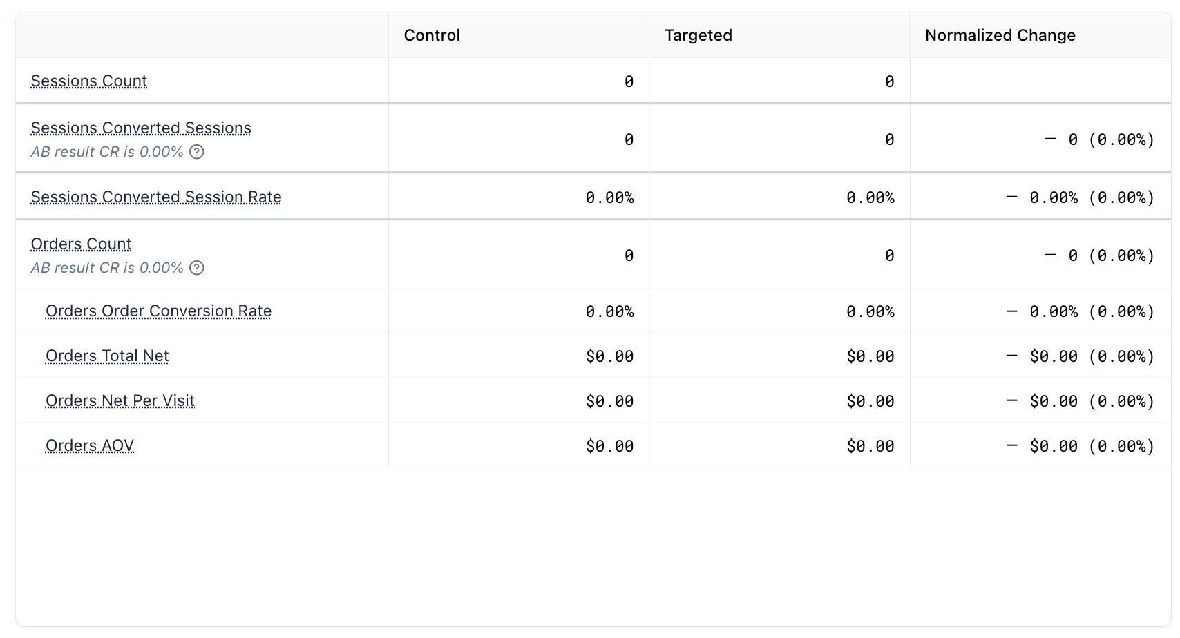 A/B Testing Table
Provides a summary of your Fanplayr A/B testing results.
Automatically includes information related to statistical significance of the findings
Best for: Reviewing A/B experiment performance
RFM Chart
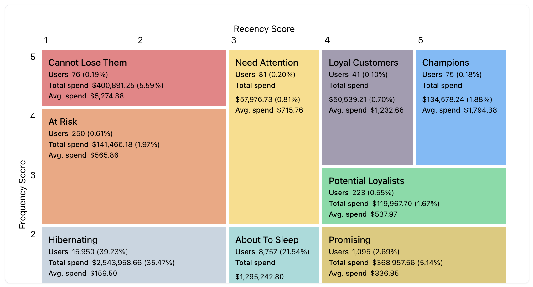 RFM
RFM
Visualizes Recency, Frequency, and Monetary (RFM) segmentation. Helps you understand the distribution of user value and engagement.
- Best for: Customer lifecycle insights and targeting strategies
Choosing the Right Chart
| Goal | Suggested Chart |
|---|---|
| Snapshot of key metrics | Measure Group |
| Show user journey drop-off | Measure Funnel, Customer Waterfall |
| Explore data in detail | Table, Heatmap |
| Compare categories | Column/Bar Chart, Stacked Column, Pie Chart |
| Analyze time trends | Line Chart, Area Line |
| Segment users by value | RFM Chart |
| Visualize stream or test results | Stream Table, A/B Testing Table |
| Visualize relationships in data | Bubble Chart |
Editing Chart Options
Different visualizations can have a different set of options, though most allow you to select a color scheme.
Axis Settings
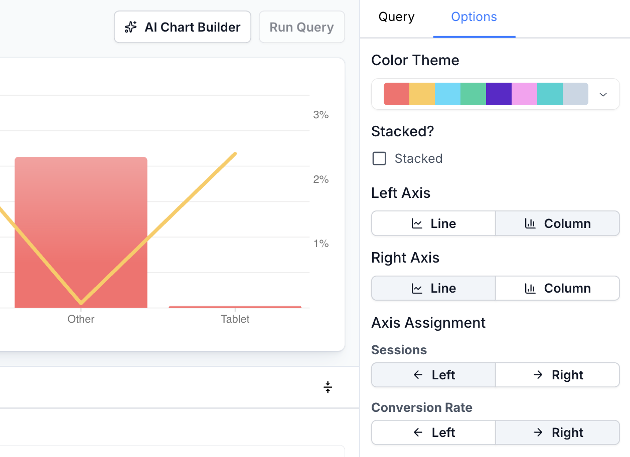 Combo Chart Options
The settings visible in the screenshot above are applicable to the following chart types:
- Column Chart
- Stacked Column Chart
- Line Chart
- Area Line Chart
- Combo Chart
You can customize various elements of these charts in the options tab. Selecting one of the chart types above is essentially telling the system to "default" the options here to certain pre-defined settings. This means that you can make a "Line Chart" look exactly like a "Column Chart" by changing all axes from "Line" to "Column".
- Stacked: Whether to stack the resulting applicable lines / columns
- Left / Right Axis: Render any data bound to the left / right axis as "Column" or "Line". This can be different between axes.
- Axis Assignment: For each measure, you can choose which axis in which to bind the data. For example, you may want to bind a small percentage value like "Conversion Rate" to one axis, while keeping a larger value like "Non-Bounces" on a separate axis.